←   Back to home

Removing the friction behind CAKE's onboarding experience

Improving onboarding meant changing more than the screens, from unnecessary signup requirements to eKYC recovery and manual approval.

RoleProduct Design Lead
CompanyCAKE by VPBank
ProductConsumer digital banking app
PlatformsiOS and Android
CAKE onboarding research and customer validation
Improving onboarding meant changing more than the screens, from unnecessary signup requirements to eKYC recovery and manual approval.
How do you onboard 1 million users without sacrificing trust or security?

Context

CAKE launched with an ambitious goal: reach 1 million users in the first year and 3 million users within two years.

That made onboarding an important part of the product. Every new customer had to get through registration, identity verification, and account approval before they could use the bank.

The existing flow had several obvious usability issues. But once we looked more closely, some of the bigger problems were outside the screens themselves.

The Problem

Users were not always clear about where they were in the process, what they needed to do next, or how long account activation would take.

There were also more structural problems:

  • Email verification was required during registration, even though email was not important to many early customers.
  • Automated eKYC rejection was effectively a dead end.
  • Accounts sent to manual review could take up to 48 hours to approve.
  • The original dark visual direction did not create the sense of trust many customers expected from a banking product.

The eKYC rejection rate was particularly high:

14%of verification attempts were rejected

My role

I led product design for onboarding and worked across Marketing, Engineering, Operations, Risk, and Legal. The interface was part of the work, but improving onboarding also meant questioning some of the requirements and processes behind it.

Not everything could be fixed by redesigning the flow.

Key Product Decisions

Remove mandatory email registration

Marketing originally required email verification during signup. Research showed that 28% of customers never opened the email they registered with, and email was particularly irrelevant to parts of our early customer base.

Rather than improving the verification step, we removed the dependency and made email optional.

Outcome

Reduced drop-off during registration
Introduce manual review for eKYC edge cases

Automated identity verification had a harder problem: rejection was effectively a dead end.

We introduced manual review for mismatch cases rather than forcing legitimate customers out of the onboarding journey.

Outcome
14% → 3%

eKYC rejection rate reduced

Reduce manual approval waiting time

Every account went through full manual review before approval, a compliance requirement carried over from a legacy risk framework, regardless of the account's actual risk profile.

I proposed a risk-tiered approach instead: classify accounts by risk signal, and route only ambiguous cases to manual review. Challenging an inherited compliance requirement meant Legal and Risk needed more than a design rationale, so I brought the tech team in to explain the system's capability and show how low the expected miss rate actually was. Once they could evaluate the reliability directly instead of just the proposal, they agreed to the tiered process.

Outcome
48h → 24h

Manual approval waiting time reduced

Transition from dark theme to light theme

CAKE originally used a dark theme. In customer research, 63% preferred a lighter interface and associated it more strongly with readability and trust for a banking product.

63%

of customers preferred a light theme

We gradually moved the product toward a light theme without rebuilding the existing layout structure.

Outcome

Improved readability, accessibility, and user trust

The interface after those decisions

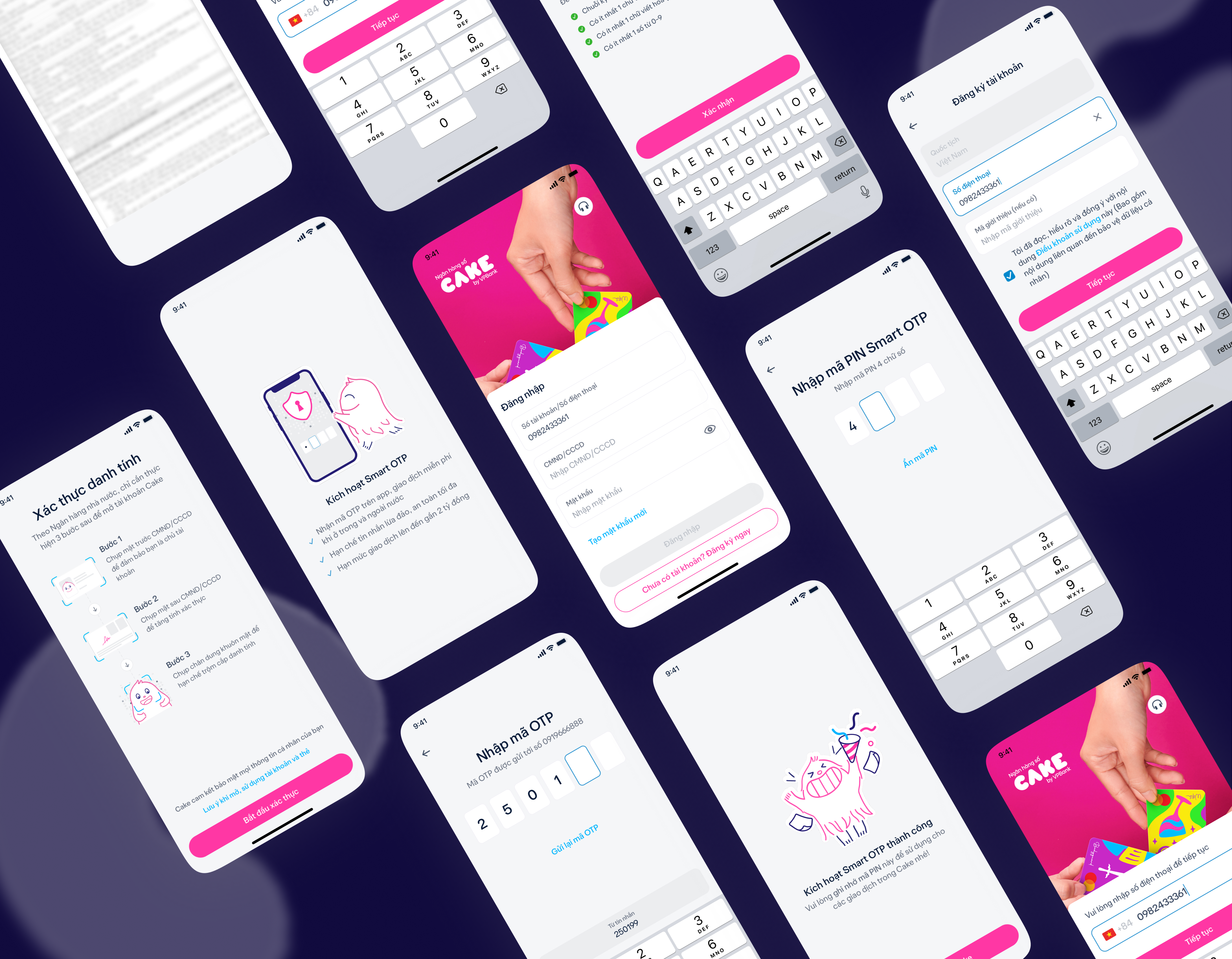
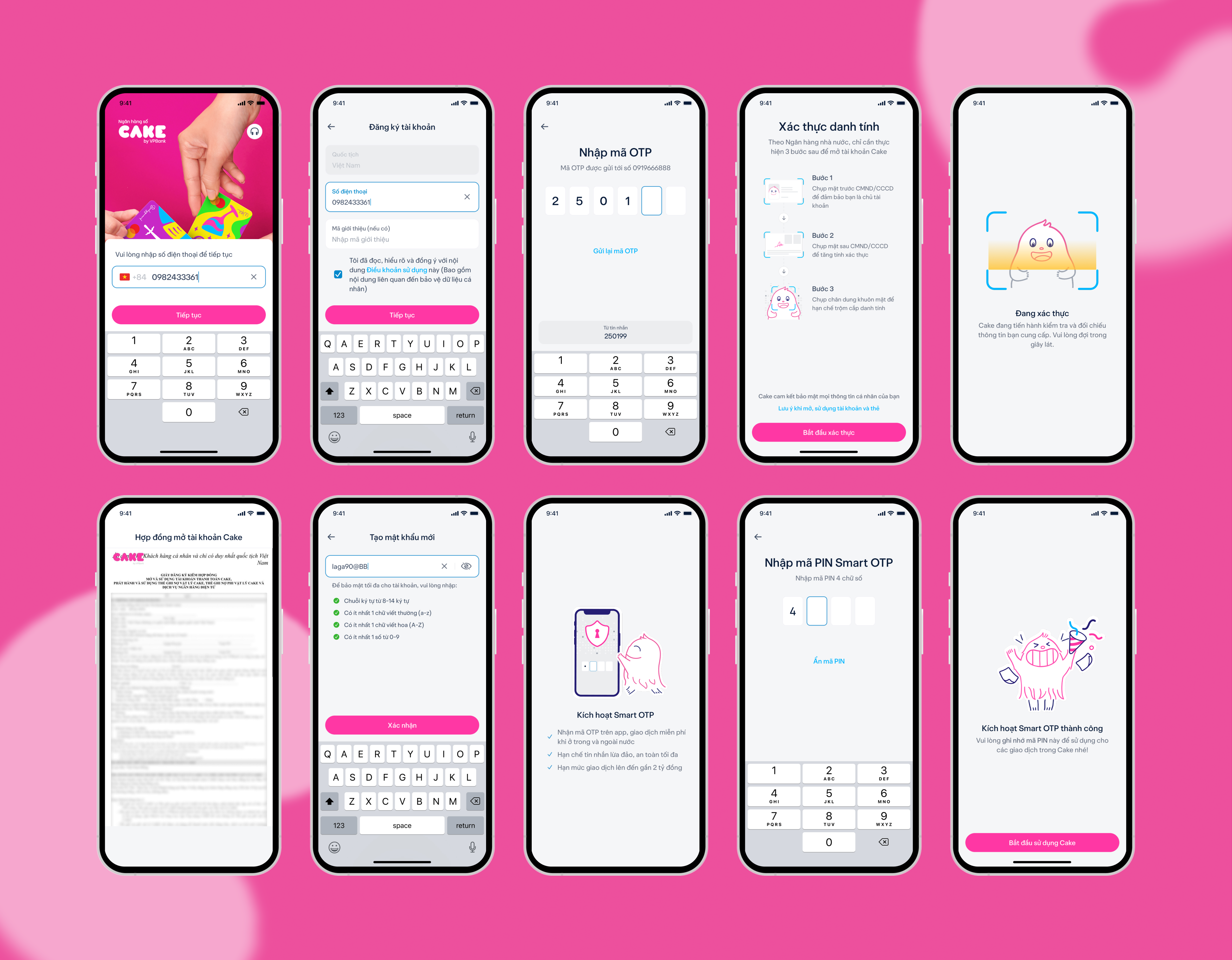
With some of the structural friction removed, the remaining interface work became much simpler: clearer steps, fewer unnecessary inputs, and more explicit guidance around identity verification.

The aim was not to make onboarding feel impressive. It was to make it difficult to get lost.

Redesigned CAKE onboarding screens

Customer Validation

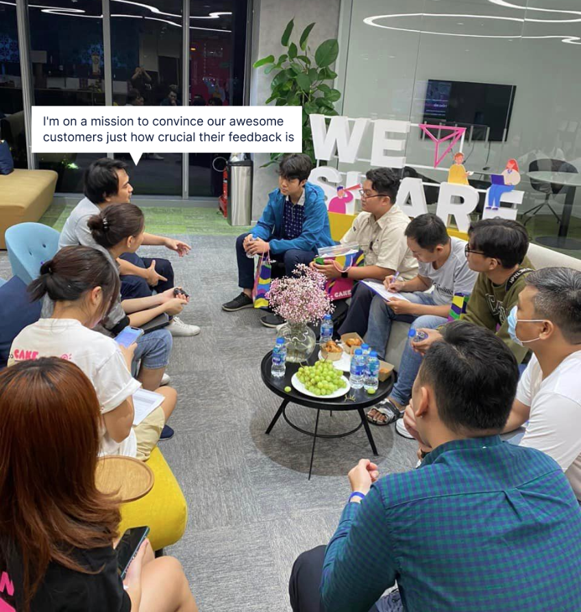
After launch, we ran six two-hour focus groups across customers who had experienced the old flow and those who joined after the redesign.

Identity verification remained the point of highest uncertainty. The sessions helped us refine how instructions and visual cues explained what was happening and what users needed to do next.

Focus group interviews with CAKE customers
Focus group interviews with CAKE customers during onboarding validation sessions
Key Insight

Many users felt uncertain during identity verification.

Clearer guidance and visual instructions significantly increased confidence in completing the onboarding process.

6

Focus group sessions

~2h

Per session

2

User cohorts

What changed

One of the fastest onboarding journeys among digital banks in Vietnam.

Users can complete the process in approximately 2 minutes with about 15 taps.

Verification success

14% → 3%

eKYC rejection rate reduced

Completion efficiency

~2 min

to complete onboarding

15 taps

from download to home screen

Operational improvement

48h → 24h

Account manual approval waiting time reduced

CAKE reached 1 million users in 10 months and 3 million within roughly 1.5 years. These are company growth figures rather than outcomes I attribute directly to the redesign; they indicate the scale the onboarding experience was supporting.

Reflection

Several problems that looked like UX problems were not really interface problems.

Email did not need a better verification screen. It needed to stop being mandatory. An eKYC rejection needed a recovery path. A 48-hour approval process needed the process itself to change.

The interface still mattered. But some of the most useful design decisions happened before there was anything to design.